Monday

I want to go back home and PAINT

Franz Kline
Untitled
1959
 
I have come to the conclusion that my excessive use of water on a canvas is becoming a problem. From all the artists I have looked at that I have liked, most of them show very thick layers of paint and texture. The problem is that I don't even know where to start in terms of 'high quality' paint that I could use and would let me achieve that rich color texture just like Kline's work. Unlike my paintings, Kline's paintings do not seem as washed out. Instead his work is able to keep a certain vibrance. My work on the other hand, seems to lose its color very quickly.
I need to work on that. 

Do Its Own Thing

Mark Toby
Trio
1970
 
Mark Toby
Canticle
Casein on Paper
1954
 
 
I still don't understand how people can let their paintings do their own thing. Whenever I paint on a canvas I feel like I am controlling way too much the flow of the drips of paint and the splashes. Mark Toby was an American painter from Wisconsin who focused mostly on abstract paintings. He is also well know for his 'white writing' which is a sort of caligraphy on abstract fields. Apparently Toby's painting Bars and Flails inspired Pollock's Blue Poles.

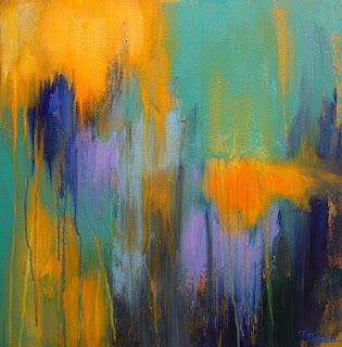
Daylight Dawning

Theresa Paden


Daylight Dawning


Portal

Female abstract painter, Theresa Paden does a lot of work that involves her emotions and her love for paint. “My abstract paintings allow me to explore color, light, and texture. Each painting is a joyful journey of layering colors and letting my heart lead the way.“ In her recent work Portal, you can clearly see the rich texture and use of thick layers - something I have not been able to achieve in most of my paintings. 


Art for Obama

Brice Marden


Obama Letter

I am not a big US politics fan but this artwork was made by Bruce Marden for Barack Obama. In an attempt to aid the Democratic re-election campaign, Marden participated in the "Artists for Obama" campaign fundraiser where he donated his work in support of the democratic party. The fundraiser included lithographs, etchings and screen printings. I am not really sure what Marden was trying to convey in this painting but I really his work because it has that minimalism aspect of simplifying art down to a color.  

Painting is Medium of Time

Valerie Favre


Going back to the idea of being able to add more depth to my work, abstract painter Valerie Favre does a lot of work that involve the sort of color scheme I like to work on. Her work is mostly related with space and time. One of the things I really like about her work is that she creates very soft and subtle smoke forms in her paintings without any signs of brush stroke or tool interventions. I want to learn how to be as subtle as possible with my brush strokes. 

Brazil

Derek Hess


Forsake
Ink and Acrylics

Derek Hess is an artist from Cleveland that does a lot of work with pen, ink and acrylics. Hess was one of my favorite artists back in high school and he was the one who inspired me to start using mixed media rather than just oils or acrylics. He was also the one that got me obsessed with the skulls and weird angels. 

"Don't sell yourself out"


Mark Licari


Acrylic and Pencil on Wall
2011

Back in the day when I was in high school I used to have an obsession with charcoal and pencil drawings. I used to draw skulls and very creepy angels with broken wings (no I was not an emo) I stopped doing pencil drawings because the idea of getting too technical with my drawings was boring me. I have always been a perfectionist and drawing became more of a tedious work I had to 'get right' rather than something I really enjoyed. Licari's work reminds me of the kind of drawings I used to make. There was a point in high school where I transitioned from drawing to abstract painting where I even started doing both (drawings on top of an abstract landscape). It wouldn't be a bad idea to go back to the old ways in the future.